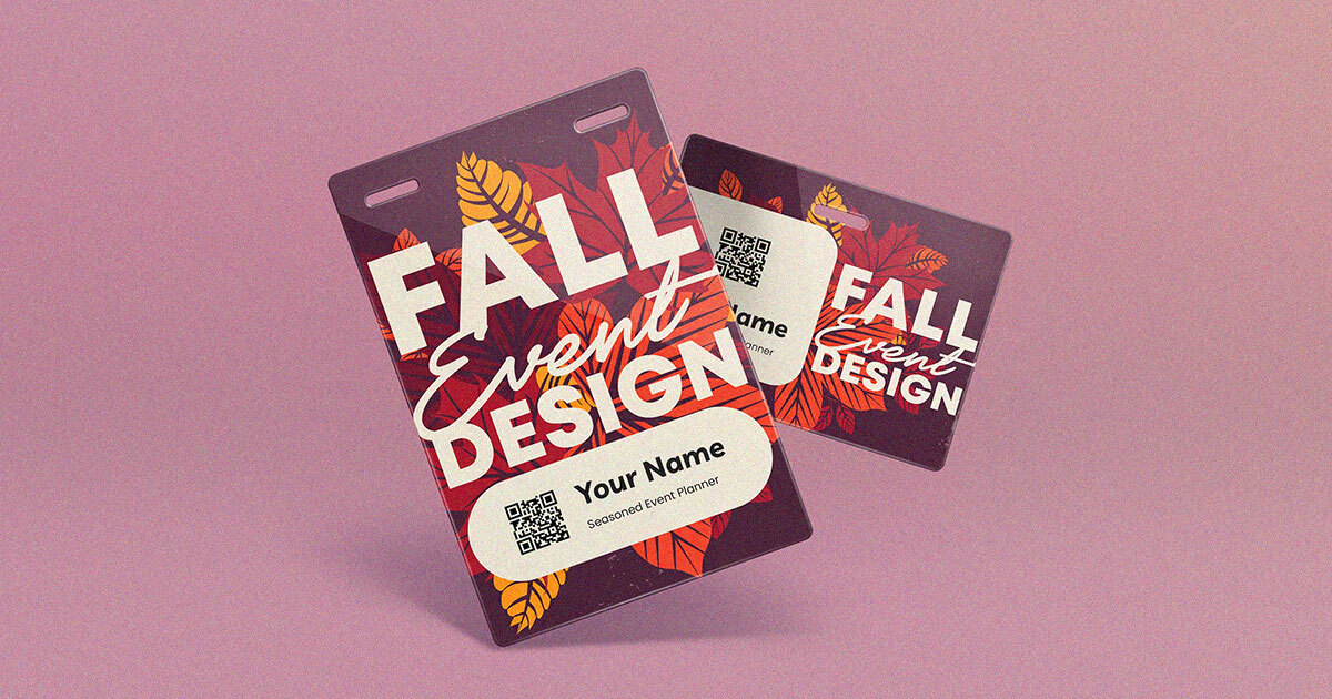
Fall events get decorated more than they get designed. The gourds and the string lights arrive, the badges stay generic, and the theme stops at the entrance. A fall design that actually holds together starts with a palette and a material story, then applies both to the things every attendee touches: the badge, the lanyard, the signage, and the stage.
Take your fall event from palette to print
Pick three colors and one accent, then hold that line across print, digital, and physical elements. Autumn palettes are especially easy to overload, because every warm color feels seasonally correct. Restraint is what separates a designed event from a themed one. For the season's broader color story across the whole room, start with our fall design trends for event planners, then come back here for what it means on the badge.
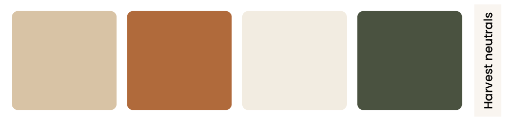
Harvest neutrals
Warm sand, clay, and bone with a deep olive accent. Reads as premium rather than festive, and pairs well with kraft or recycled paper stock. Best for corporate summits and association meetings that want the season without the costume. Try #d8c3a5, #b06a3b, #f2ece1 with #4a5240.
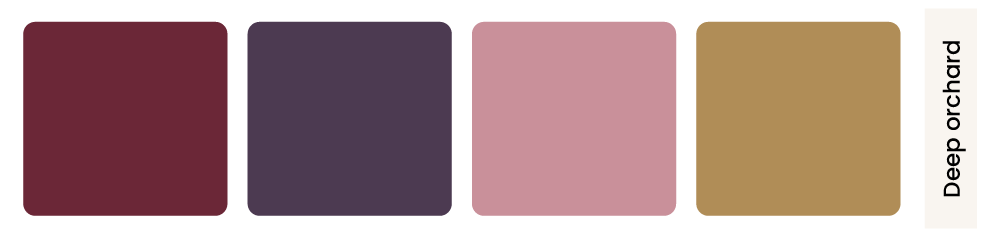
Deep orchard
Burgundy, plum, and dusty rose with a brass accent. The evening palette. Works for galas, awards nights, and donor events where the room is dim and the photography is candlelit. Try #6b2737, #4c3a51, #c9909a with #b08d57.
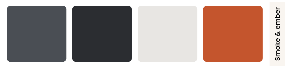
Smoke and ember
Slate grey and charcoal with a single rust or ember orange. The most modern of the four, and the easiest to keep on brand if your identity is already cool-toned. One warm color against grey is enough. Try #4a4e54, #2b2d31, #e8e6e3 with #c4552d.
Golden hour
Amber, cream, and honey with a soft green accent. Bright, outdoor-friendly, and the best of the four for daylight photography. Suits festivals, campus events, and anything happening under a tent. Try #e0a458, #f7f0e4, #c98b2e with #7d8c6a.
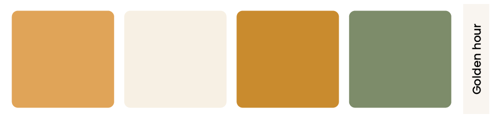
Test the palette in real light. Amber and cream that look warm on a monitor can wash out to near-white in outdoor daylight, and the burgundy that photographs beautifully in a ballroom can read as flat brown under LED uplighting. Print a sample before you commit a full run.
Textures and materials that read as autumn
Color does half the work. The other half is what the material feels like in the hand, which is the part attendees notice without being able to name.
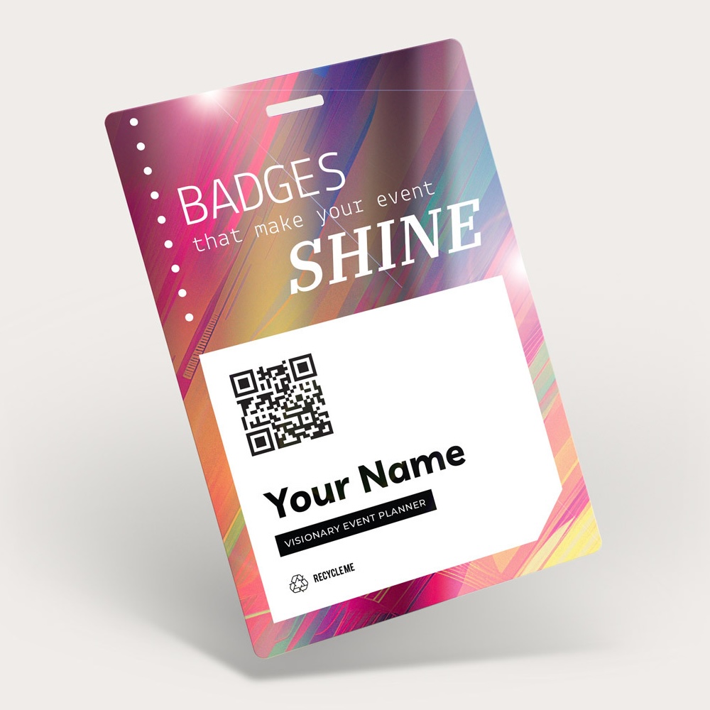
- Uncoated and recycled paper stock: A matte, slightly toothy surface reads as seasonal and grounded where gloss reads as summery. Our heavyweight recyclable paper badges come in 9.5 pt and 18 pt.
- Metallic accents used sparingly: Brass, copper, and antique gold catch low autumn light. A metallic ink rule or logo mark does more than a metallic background ever will.
- Layered background art: A mosaic background in your palette gives the badge depth without adding a literal leaf illustration.
- Heather and earth-tone lanyards: Muted, textile-looking custom lanyards carry the palette better than a saturated primary, and they photograph well against fall outerwear.
- Matte laminate on plastic: If you need the durability of 30 mil PVC, a matte finish keeps it from looking like a summer festival credential.
Materials carry further than the badge. For layered textures, sensory details, and sustainable choices across the whole room, see our guide to fall event design and theming.
Carry the theme onto the badge
The badge is the one design element every attendee carries for the whole event, and it is usually the last thing a seasonal theme reaches. A few decisions get you most of the way there.
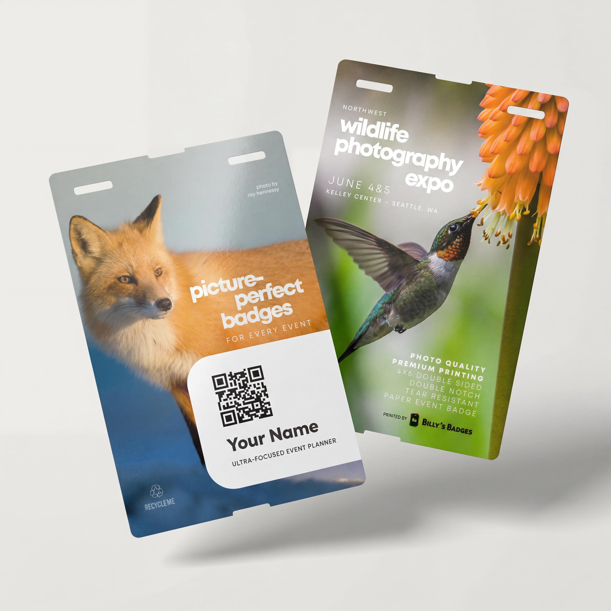
- Use the accent for tiers, not decoration: Color-band your speaker, sponsor, and staff tiers in the palette so the functional system and the theme are the same system.
- Keep the name area clean: Seasonal art belongs in the top third and the border. Names need high contrast on an uncluttered field to stay readable across a room.
- Match the lanyard to the accent, not the background: A lanyard in the accent color makes the palette legible from a distance.
- Design the back: Fall events run long. Put the schedule, venue map, or Wi-Fi details on the reverse of a 4 x 6 badge and it earns its place all weekend.
Fall-specific constraints worth designing around
- Coats and layers: A lanyard that hangs correctly over a blazer sits wrong over a puffer jacket. A 3/4 inch lanyard at a longer drop keeps badges visible and scannable through outerwear.
- Weather: Outdoor or partly outdoor fall events need clear badge holders. Paper stock in the rain without a holder is a reprint queue.
- Shorter daylight: Golden hour arrives early, and photos taken in it flatten contrast. Palettes with one dark anchor color hold up better than four mid-tones.
- Holiday-season lead times: Late fall production runs into the year-end crunch. Custom lanyards need 10 to 12 business days after proof approval before shipping is even in the picture.
A fall theme that reaches the badge is one attendees carry for three days, not one they walk past at the door.
Shop badges and lanyards Get a sample pack
Frequently asked questions
How many colors should a fall event palette have?
Three plus one accent. Autumn tempts you toward five or six because every warm tone feels seasonally right, and the result reads as busy rather than designed. Hold three, and use the accent only for tier markers and small emphasis.
Do fall colors print accurately on badges?
Deep burgundies and muted olives shift more between screen and print than bright primaries do, because they sit in ranges where CMYK has less room. Order a sample and check it in the actual light of your venue before committing a full run.
What badge material suits an autumn theme best?
Uncoated recyclable paper at 18 pt has the matte, tactile quality that reads as seasonal, and it pairs naturally with sustainability messaging. If your event is outdoors or runs multiple days, pair it with a clear holder or move to 30 mil plastic with a matte finish.
How far ahead should I order for a fall event?
Work backward from the lanyards, which are the long pole. Custom lanyard production runs 10 to 12 business days after proof approval, plus shipping. Late-season events also compete with year-end volume, so build in an extra week if your date sits in November.
Can a seasonal badge design still work with our brand colors?
Usually yes, and the smoke and ember palette is built for it. Keep your brand color as the anchor and add one warm seasonal accent rather than replacing your identity for the season. The badge should still look like your event first.