
Event planners mix creativity with sharp execution. Staying ahead of design trends is part of the job — whether you're working on event websites, attendee touch-points, UX/UI, or product design. This guide walks through four design trends shaping event branding right now, with real brand case studies and concrete ways to apply each — from theming and custom event badges to website design and digital branding.
Organic elements: connecting with nature
Trend insight: Embracing organic elements in your designs isn't just about a natural aesthetic — it's a statement on sustainability that resonates with environmentally aware audiences. The trend connects to broader themes of environmental responsibility and the raw beauty of the natural world. By weaving natural textures, earthy colors, and organic shapes into your work, you're connecting people to the planet and fostering a sense of calm at your events.
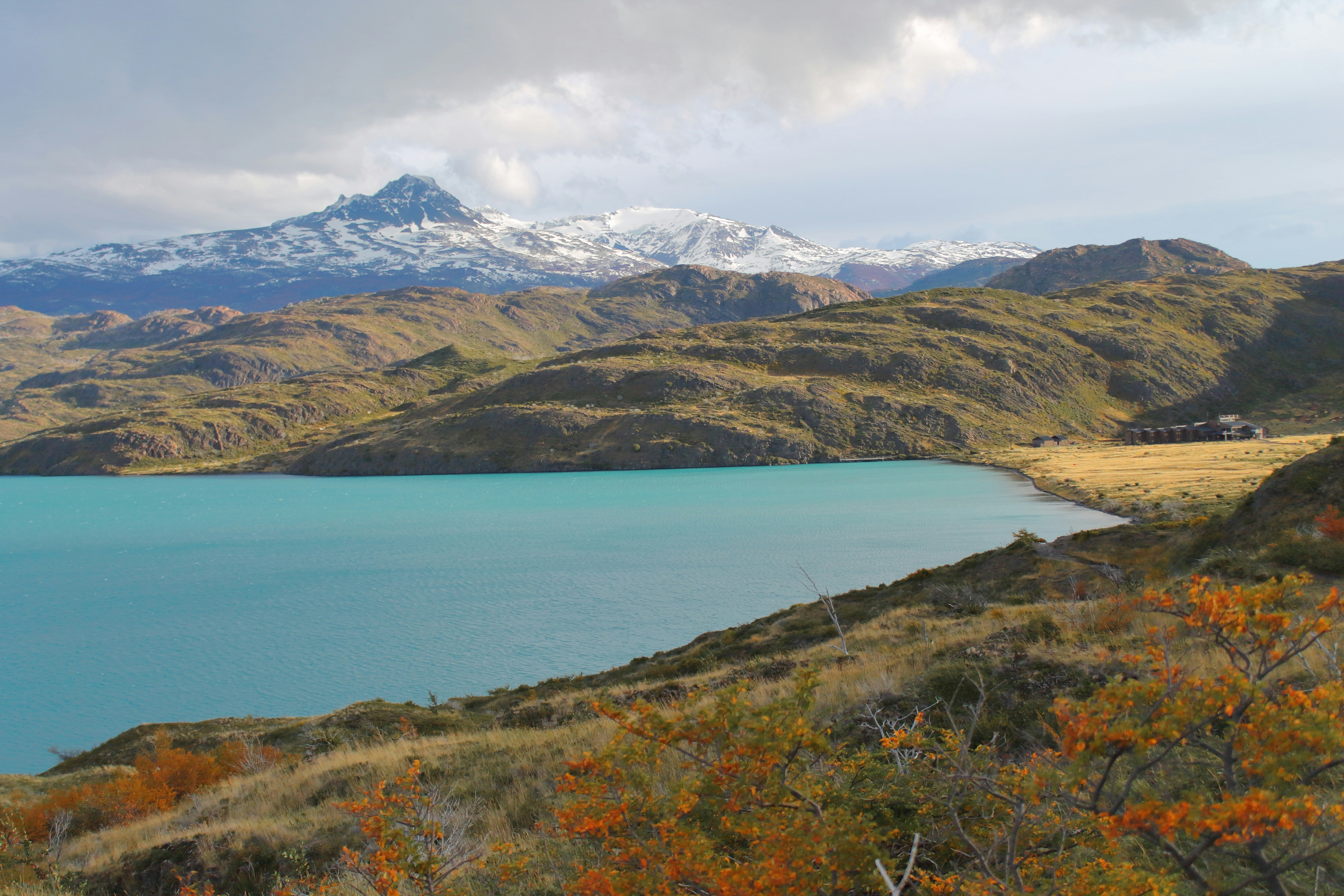
Imagine outfitting your custom event badges and conference lanyards with an earthy color palette, botanical motifs, organic shapes, or vibrant floral patterns. This isn't just a style choice — it's a way to deepen the attendee experience and make every moment at your event more engaging. It also aligns with the broader push for environmental responsibility.
Brand examples
Patagonia uses pure, unfiltered natural scenes throughout its marketing to captivate its nature-loving audience. The commitment amplifies their position on environmental conservation and creates a genuine bond with consumers who care about the planet.
Aveda goes all-in on botanical elements and soothing, natural hues to spotlight their use of organic ingredients. Their visuals evoke wellness and purity, syncing with their mission for holistic health.
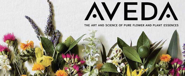 Aveda: botanical visual identity
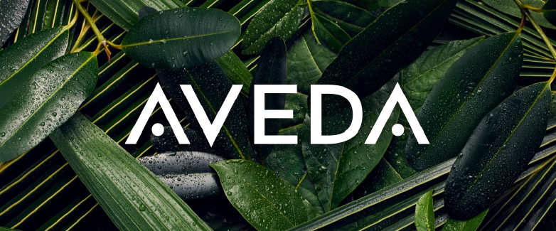 Aveda: natural color palette in packaging
How to apply it
When planning your event's theme and design, go fully sustainable. Choose materials like bamboo, linen, or recycled wood to reinforce the eco-friendly vibe. For your custom event badges, consider biodegradable materials and incorporate natural motifs — leaves, waves, organic forms — to tie it all together. When building digital marketing, opt for color palettes that echo the natural world — soft greens, blues, and rich earth tones. The approach feels welcoming online and shows your commitment to the planet in every pixel and every piece of event swag.
Looking for materials that fit the aesthetic? Check out eco-friendly badge designs that match the organic style.
Vibrant color: making a bold statement
Trend insight: Vibrant colors are back in the spotlight, especially in digital marketing and branding. Bold, saturated hues catch eyes and create memorable impact — perfect for brands looking to stand out or show off their creative chops. For event branding, vibrant color works on personalized event badges and lanyards, helping you differentiate attendee types, highlight key event features, and energize every interaction.
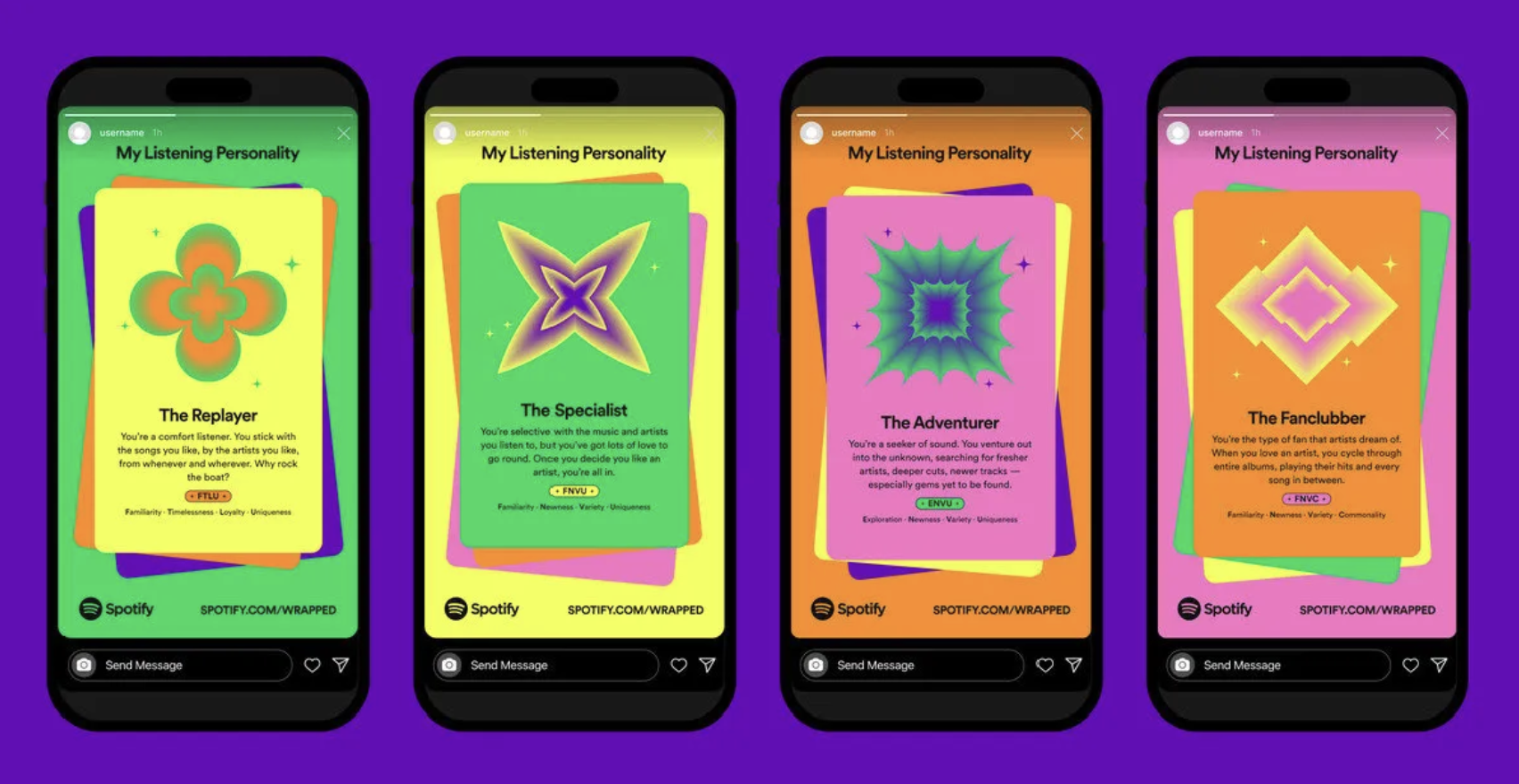
This isn't just about looking pretty — it's about making functional items more engaging. Whether differentiating between attendee types or highlighting key event features, vibrant colors elevate both the function and the overall vibe of your event. The trend ensures that designs pop while energizing attendees and making interactions memorable.
Brand examples
Spotify uses vibrant gradients and high-contrast colors throughout its user interfaces and promotional materials. The colors aren't just pretty — they mirror the energy and dynamism of music, creating an immersive experience.
Adobe is a pioneer in this space, using dynamic colors to spark creativity. Their approach is visually stimulating and encourages users to break boundaries.
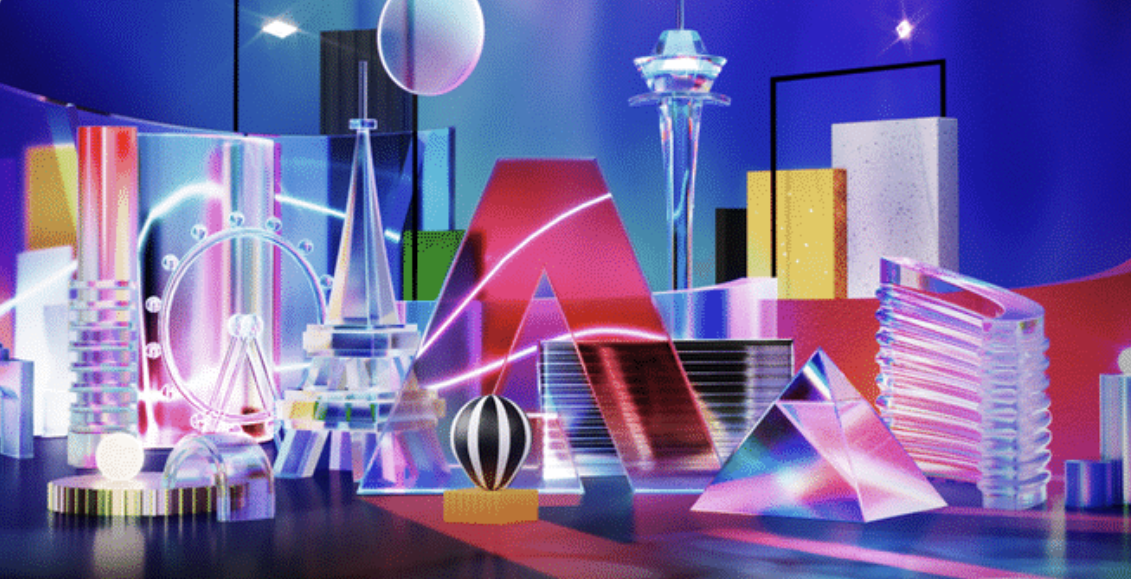
Infuse your event design with vibrant colors to keep energy high and engagement deep. Bright, bold hues on your conference badges and lanyards make them stand out and stick in attendees' memories long after the event ends.
Whimsical style: fostering creativity and fun
Trend insight: A whimsical style is perfect for crafting a friendly, approachable brand identity. It's all about playful illustrations, quirky fonts, and imaginative layouts that ramp up engagement and inject fun and creativity into your branding. The approach is a great way to add light-heartedness and humor to your visual presentation, making your brand seem more innovative and welcoming.
For events, embracing a whimsical style in your promotional materials amps up accessibility and appeal, potentially boosting participation rates. Fun visuals and creative motifs create an inviting vibe that encourages attendees to dig deeper into what your event offers — and helps your event stand out in a crowded market.
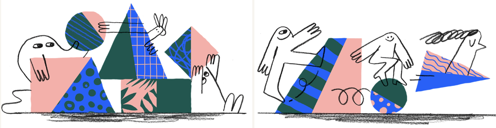
Dropbox has mastered this. With playful illustrations and animations, they turn the simple act of sharing and storing files into a delightful experience. Their use of abstract shapes and fun characters transforms everyday tasks into something more engaging — winning the hearts of creative professionals everywhere.
Retro design: harnessing nostalgia
Trend insight: Retro design in branding is like a time machine, bringing back the best of past decades to make a splash in today's crowded markets. The trend plays on styles, colors, fonts, and imagery from yesteryears to evoke warmth and simplicity. It works for audiences who lived through those eras — and equally well for younger crowds drawn to its timeless appeal. Retro branding projects reliability and tradition, resonating with consumers who crave authenticity and offering a unique, sometimes whimsical vibe that fosters real emotional connections. Think vintage typography, muted color palettes, and classic motifs working together to create a comforting, familiar feel.
Brand examples
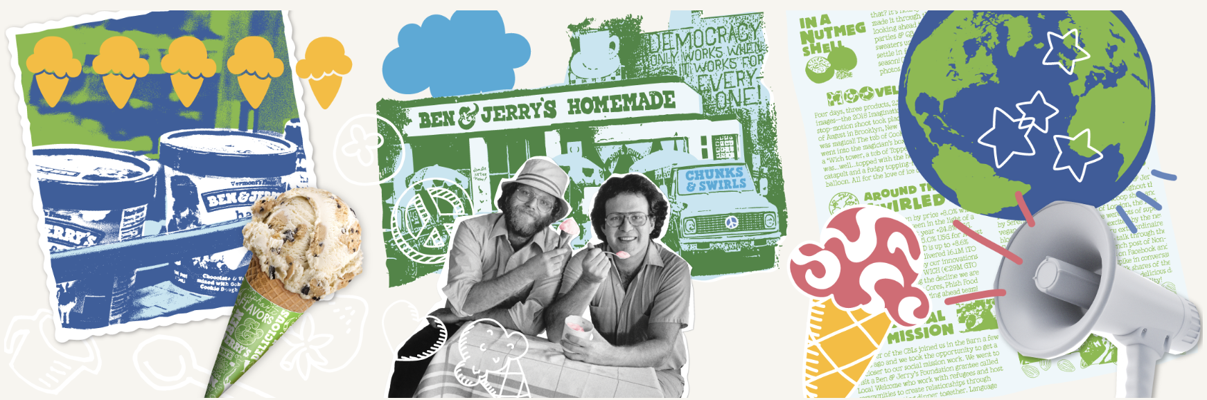
Ben & Jerry's nails this approach by infusing their packaging with funky 60s and 70s style fonts and color schemes, making their ice cream tubs pop off the shelves while broadcasting the brand's fun-loving, nostalgic spirit.
SXSW incorporates elements from past decades, capturing the eclectic and innovative spirit of the music, film, and tech scenes that the festival celebrates. The retro accents become part of the festival's identity.
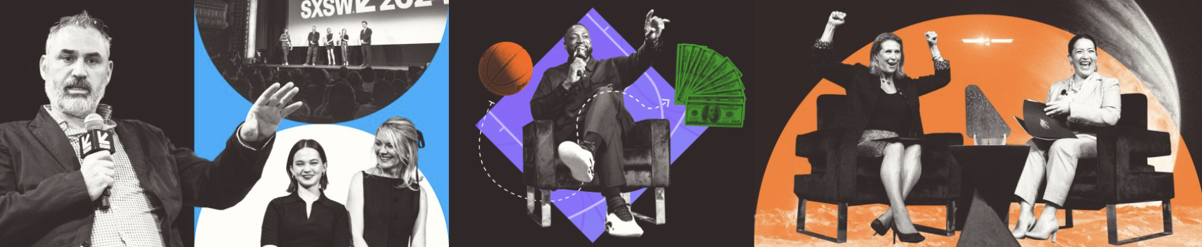
How to apply it: Inject some old-school cool into your event with vintage-inspired themes for decor and promotional materials. Whip up custom event badges with classic fonts and retro color palettes that attendees will want to keep. For digital marketing, lean on retro-inspired graphics and typography to charm an audience that loves a nostalgic vibe.
Applying these trends across your event
To make these design trends sing, ensure they align with your brand's identity and what you're trying to achieve with each project. Here's how to weave the trends into your work without losing brand cohesion.
- Event marketing and branding: Opt for vibrant colors to inject energy and attract attention for high-spirited events. For more laid-back or creatively themed gatherings, add a dash of whimsy or a touch of retro. These styles make your promotional materials — including custom event badges and conference lanyards — more relatable and engaging, encouraging potential attendees to join in.
- Website and UI/UX design: Make interfaces pop with vibrant colors, but keep them user-friendly to ensure everyone can navigate your site with ease. Softening your digital presence with organic elements makes technology feel more accessible and less daunting.
- Product design: If you're designing products for the eco-aware crowd, blend in organic elements. The approach boosts functionality and appeals to environmentally conscious customers. Don't shy from bold colors to make products stand out and resonate with the energy of your brand.
Maintaining a cohesive brand image across all platforms is the through-line. Every design choice should reflect your brand's personality and enhance interactions — whether through physical products, digital interfaces, or live events. Keep your target audience and the design context in mind, and you'll maximize impact while ensuring every design hits the right note.
Integrating current design trends into branding and marketing strategies takes more than splashing around colors and styles. It requires understanding your brand's core values and your audience's needs. Thoughtfully applied, these trends create engaging, memorable experiences that attract attention and build lasting connections.