
Your event badge is the first thing every attendee sees at the door, and the print choices behind it decide whether it looks sharp or forgettable. Get the resolution, color mode, and finish right, and custom event badges stop being a formality and become something people actually want to wear, a clear reflection of your brand. This guide covers the design details that make personalized event badges work, from artwork resolution to the print upgrades worth considering.
Pixel perfection
The gap between a 72 DPI image and a 300 DPI image is easy to miss on screen and impossible to miss in print. At 72 DPI, artwork that looked fine on your monitor turns fuzzy and soft. At 300 DPI, the same design prints crisp and clean. Hand that difference to hundreds of attendees and it shows up on every badge.
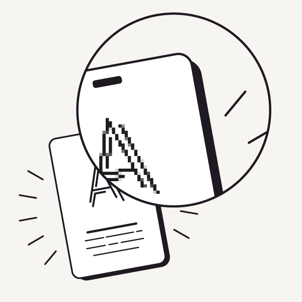
72 DPI: The standard for screen images. Fine on your monitor, but printed, it pixelates. Your logo or intricate artwork loses its sharpness. Not the look you want on hundreds of badges.
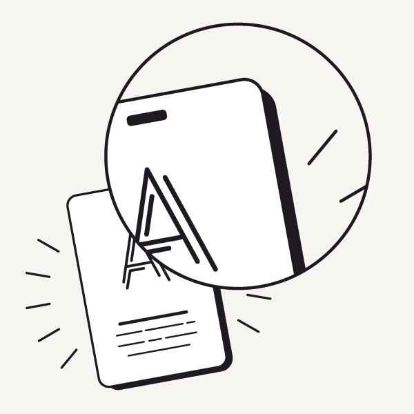
300 DPI: The industry standard for high-quality printing. Every line and color comes through cleanly. Professional and sharp, the first impression you want at the door.
Pro tip: First impressions land on the badge. Make it one that earns a second look. Start with crystal-clear, high-resolution artwork.
Connect in color
Color mode is like choosing the right language for the medium. Get it wrong and the message gets lost in translation. RGB is built for light and looks vivid on screen. CMYK is built for ink and matches what actually comes off the press. Knowing which one you're designing in saves you from surprises at print time.
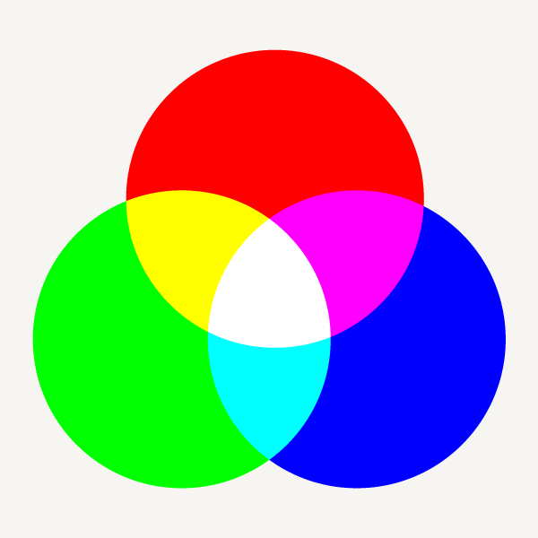
RGB: Red, green, blue, the primaries of light, made for digital displays. The on-screen color range is huge. But in print, RGB shifts and dulls, and some of that on-screen brilliance is lost in translation.
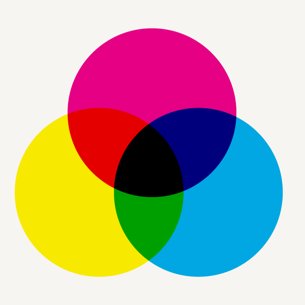
CMYK: Cyan, magenta, yellow, key (black), the inks of print. A narrower gamut than RGB, but built for reproduction on paper. Design in the printer's native language and the colors you see on screen are the colors on the badge.
Pro tip: Design in CMYK from the start. Converting from RGB at the last minute is where surprises happen. Match the medium before you commit hours to a design.
Beyond basic badges
Modern printing turns personalized event badges into more than a credential. Metallic accents that catch the light and mosaic backgrounds that carry your event's theme give attendees something worth keeping, without giving up the day job of showing a clear name and title.
Metallic ink
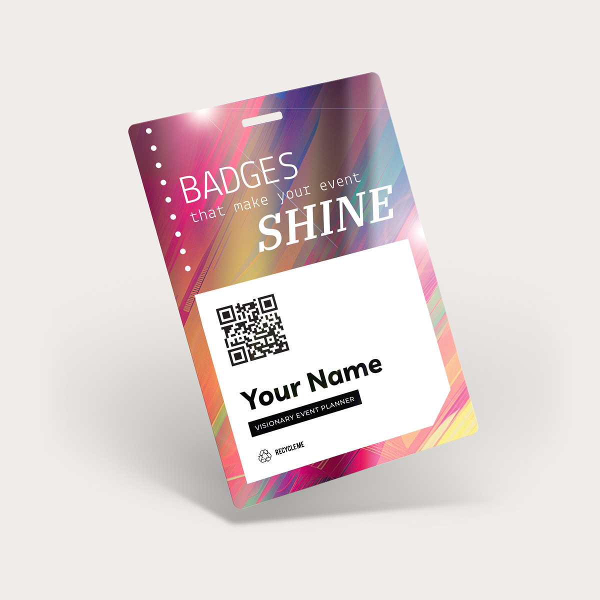
Add shimmer where it counts with metallic ink. A metallic logo or a bright accent on a key element catches the light and signals quality from across the room. Use it subtly or make it the focal point. Either way, the badge reads as a considered, premium piece.
Mosaic backgrounds
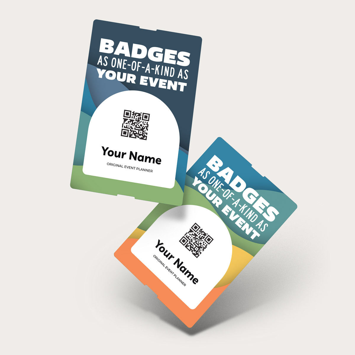
Give each badge a distinctive backdrop with mosaic backgrounds. The patterns add visual interest and spark conversation while keeping names and titles easy to read. Match the pattern and colors to your event's theme so the badge feels like part of the branding, not an afterthought.
Pre-printed names
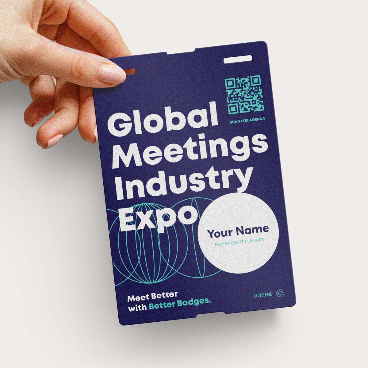
Skip on-site printing and the lines that come with it using pre-printed names. Attendees pick up a finished badge on arrival and walk straight in. Sharp text and a durable finish come standard, and your registration team spends the morning greeting people instead of running a printer.
Get the details right, from resolution to color to finish, and your custom event badges give every attendee something they're proud to wear from the very first scan.
Order a sample pack Contact us
Frequently asked questions
What resolution should my badge artwork be?
Set your artwork to 300 DPI at the final print size. Anything lower, especially 72 DPI screen graphics, can look fine on your monitor but print soft or pixelated. If you're scaling a logo up, double-check that it's still 300 DPI at the larger size.
Should I design in RGB or CMYK?
Design in CMYK from the start. RGB files can shift and dull when they're converted for print, so building in CMYK from the beginning keeps the colors on your screen much closer to the colors on the finished badge.
Can I combine upgrades like metallic ink and mosaic backgrounds?
Yes. Metallic ink, mosaic backgrounds, and pre-printed names can be mixed across an order, and even on the same badge. If you're layering several finishes, order a sample first so you can see how they interact before committing to the full run.
What do you need for pre-printed names?
Send us your attendee list as a CSV with the fields you want on the badge: name, title, company, and so on. We handle the layout and printing so every badge is finished and ready to grab at check-in.
How can I tell how my colors will actually print?
Order a sample pack before you commit to a full run. Screens and printers reproduce color differently, so holding a printed badge in both indoor and outdoor light is the surest way to confirm your artwork looks the way you intend.