
Spring is all about renewal — and for event planners, it's the perfect season to refresh your visual identity, elevate attendee experience, and rethink the details that make your event memorable (yes, including your badges).
This year's trends are blending technology, sustainability, and nostalgia in ways that feel both innovative and personal. From AI-powered visuals to eco-inspired gradients and playful pixel throwbacks, these styles aren't just aesthetic — they're strategic. Let's break down the top spring design trends and how to apply them to your event branding and badge printing.
AI-generated event design
AI isn't just a tool — it's becoming a creative partner. Designers are using AI to generate entire visual systems, from abstract backgrounds to hyper-personalized attendee experiences.
What this looks like for events
AI-generated design is showing up as more than just "cool visuals" — it's shaping entire event ecosystems.
- Adaptive visual identities: Instead of one static theme, events generate multiple variations of a design system that flex across screens, stages, and print. Your keynote screen, mobile app, and badge can all feel connected without being identical.
- Hyper-personalized touchpoints: Badges with subtle design variations based on attendee type, interests, or behavior. AI can generate unique background patterns at scale, making each attendee feel recognized.
- Immersive environments: AI-generated motion graphics and looping visuals create dynamic backdrops for stages, lounges, and networking areas — bringing energy to the space.
- Faster creative turnaround: Last-minute signage updates or sponsor integrations? AI tools let your team generate polished assets quickly without sacrificing quality.
How to use it on event badges
- Layered abstract backdrops: Use generative visuals to create custom backgrounds that go beyond standard templates — it instantly elevates perceived quality.
- Tier variations: Generate subtle variations for VIPs, speakers, sponsors, and staff using AI patterns or color shifts. Each group feels distinct without redesigning from scratch.
- Attendee-specific accents: Incorporate industry, session track, or preferences into the badge through unique visual details.
- Cohesive digital + print: Use the same AI-generated design system across digital tickets, apps, and printed badges for a unified brand experience.
- Late-stage flexibility: If speaker lineups or sponsors change, AI tools make it easy to regenerate updated badge artwork without slowing production.
Brands doing this well
-
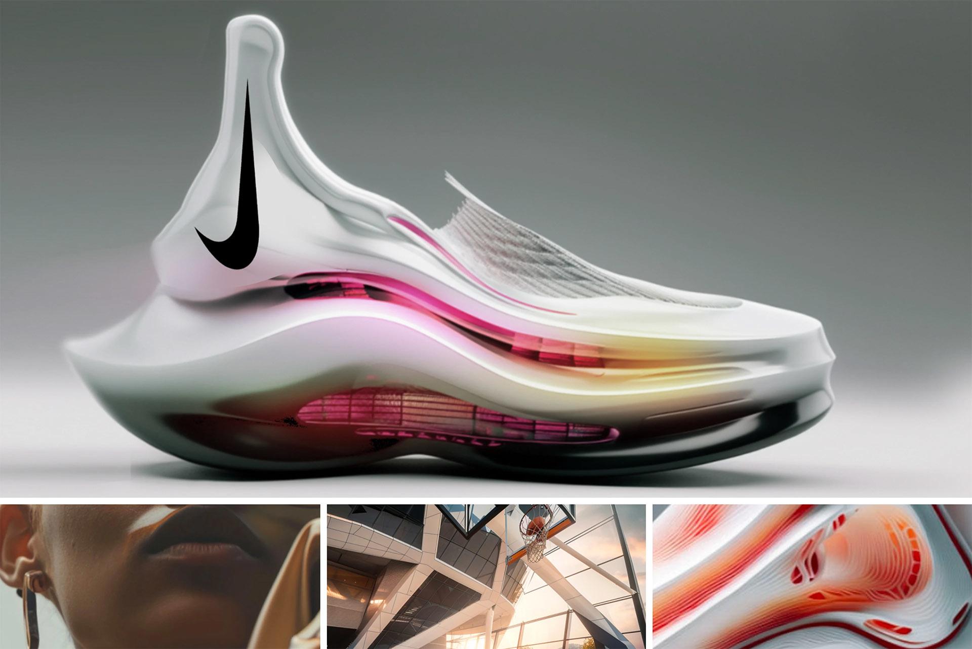 Nike — AI as innovation engine
Integrated AI into product design, storytelling, and personalization — not just ads. Reinforces Nike's core identity of innovation and performance while enabling hyper-personalized experiences at scale.
Nike — AI as innovation engine
Integrated AI into product design, storytelling, and personalization — not just ads. Reinforces Nike's core identity of innovation and performance while enabling hyper-personalized experiences at scale.
-
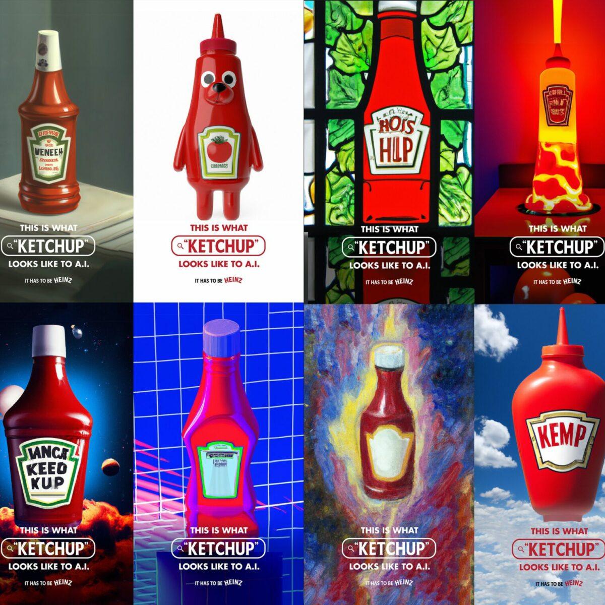 Heinz — AI as a brand idea
Ran a campaign asking AI to generate images of "ketchup" — and most outputs looked like Heinz bottles. Simple concept, deep brand insight, turning AI into a storytelling device rather than just a tool.
Heinz — AI as a brand idea
Ran a campaign asking AI to generate images of "ketchup" — and most outputs looked like Heinz bottles. Simple concept, deep brand insight, turning AI into a storytelling device rather than just a tool.
-
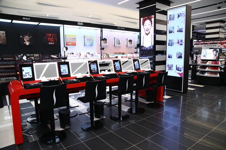 Sephora — AI for personalization
Applies AI-driven personalization and virtual try-on to tailor experiences in real time. Positions Sephora as tech-forward and customer-first, making beauty shopping feel interactive and personal.
Sephora — AI for personalization
Applies AI-driven personalization and virtual try-on to tailor experiences in real time. Positions Sephora as tech-forward and customer-first, making beauty shopping feel interactive and personal.
Sustainable event design: gradients and blends
Spring naturally brings a focus on sustainability — and visually, that shows up as soft gradients, organic color transitions, and nature-inspired palettes. Gradients are evolving beyond tech aesthetics into something more earthy, calming, and human-centered.
What this looks like for events
Gradients and blends are evolving into a softer, more natural visual language that aligns beautifully with sustainability-focused events.
- Atmospheric color storytelling: Instead of flat brand colors, gradients evoke moods — sunrise tones for morning sessions, cooler hues for evening networking, or nature-inspired palettes that reflect the event location.
- Seamless brand transitions: Gradients unify multiple brand elements — especially at sponsor-heavy events — by blending colors so the result feels cohesive rather than fragmented.
- Elevated minimalism: A simple layout paired with a rich gradient background creates a premium look without over-designing — perfect for badges, signage, and wayfinding.
- Material and color harmony: Gradients pair well with recycled, matte, or textured materials, reinforcing a sustainability story through both look and feel.
How to use it on event badges
- Full-bleed gradients: Create a seamless, high-impact look that feels polished and intentional — especially effective with high-resolution printing.
- Tiered gradient variations: Distinguish attendee levels (general admission through VIP) in a more elevated, subtle way than harsh color blocks.
- Nature-inspired palettes: Sunrise, ocean, forest tones reinforce sustainability messaging and create a calming visual experience.
- Sustainable stock pairing: Combine gradients with recycled, FSC-certified, or textured badge stock to align design with sustainability values.
- Let the gradient be the hero: Keep typography clean and simple so the gradient leads — creating a modern, uncluttered badge.
Brands doing this well
-
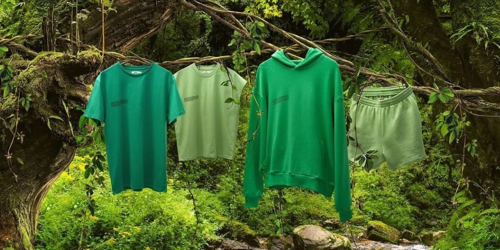 Pangaia — gradients as material storytelling
Builds its identity around tonal color systems and soft gradients, presenting products in flowing color spectrums inspired by nature, science, and material innovation. Color transitions feel optimistic and future-forward.
Pangaia — gradients as material storytelling
Builds its identity around tonal color systems and soft gradients, presenting products in flowing color spectrums inspired by nature, science, and material innovation. Color transitions feel optimistic and future-forward.
-
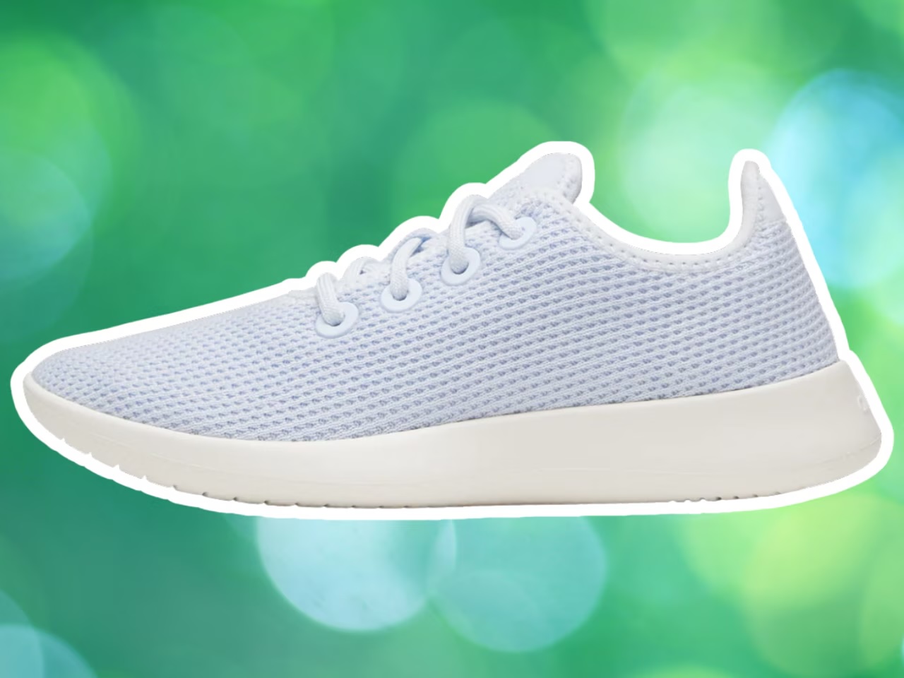 Allbirds — nature-inspired gradients
Uses sky blues, muted greens, and earthy pastels across launches and campaigns to reflect low-impact materials and environmental ethos. Soft transitions create a lightweight, breathable visual identity.
Allbirds — nature-inspired gradients
Uses sky blues, muted greens, and earthy pastels across launches and campaigns to reflect low-impact materials and environmental ethos. Soft transitions create a lightweight, breathable visual identity.
-
 Calm — gradients as emotional environment
Slow, atmospheric gradients — sunsets, night skies, ocean tones — create an immersive, emotionally soothing experience. Inspired by natural cycles, the gradients reinforce mindfulness throughout the brand.
Calm — gradients as emotional environment
Slow, atmospheric gradients — sunsets, night skies, ocean tones — create an immersive, emotionally soothing experience. Inspired by natural cycles, the gradients reinforce mindfulness throughout the brand.
Nostalgic event branding: pixel art
Nostalgia is having a major moment, but with a modern twist. Pixel art and retro digital aesthetics are back, blending early-internet charm with today's high-resolution design systems.
What this looks like for events
Pixel art is being reimagined in a way that feels intentional, not outdated — bringing personality and playfulness into modern event design.
- Micro-moments of nostalgia: Instead of going fully retro, events incorporate pixel elements in small, delightful ways — icons, dividers, or badge accents that spark recognition without overwhelming the design.
- Gamified experiences: Pixel visuals lend themselves to interactive elements — scavenger hunts, digital check-ins, or leaderboard-style networking activations.
- Social-first design: Pixel art is highly shareable. Attendees are more likely to post badges, signage, or installations that feel fun, quirky, and different from typical corporate design.
- Contrast with modern layouts: Clean, high-resolution layouts paired with pixel details create a compelling balance of nostalgia and sophistication.
How to use it on event badges
- Selective pixel typography: Use pixel-style fonts for names, titles, or headers to add personality while keeping the overall layout clean and readable.
- Role icons: Design small pixel icons for roles (speaker, VIP, staff) or tracks — adding a cohesive, playful layer to the badge system.
- Pixel accents, not full retro: Borders, dividers, or corner details rather than full-blown 8-bit treatment keep the design modern while tapping into nostalgia.
- Gamified integrations: Tie pixel design into experiences like QR scavenger hunts, digital check-ins, or achievement-style networking incentives.
- Retro meets refined: Pair pixel art with ultra-sharp printing and premium materials for a look that's intentional rather than kitschy.
Brands doing this well
-
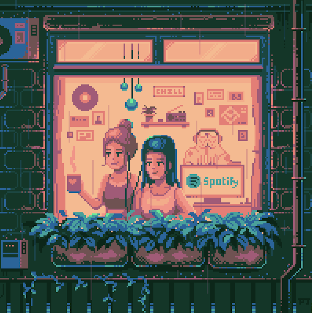 Spotify — pixel art as interactive nostalgia
Introduced pixel-inspired visuals and animations in campaigns and digital experiences, turning playlists and music discovery into interactive, retro game-like environments. Taps into gaming nostalgia for playful music exploration.
Spotify — pixel art as interactive nostalgia
Introduced pixel-inspired visuals and animations in campaigns and digital experiences, turning playlists and music discovery into interactive, retro game-like environments. Taps into gaming nostalgia for playful music exploration.
-
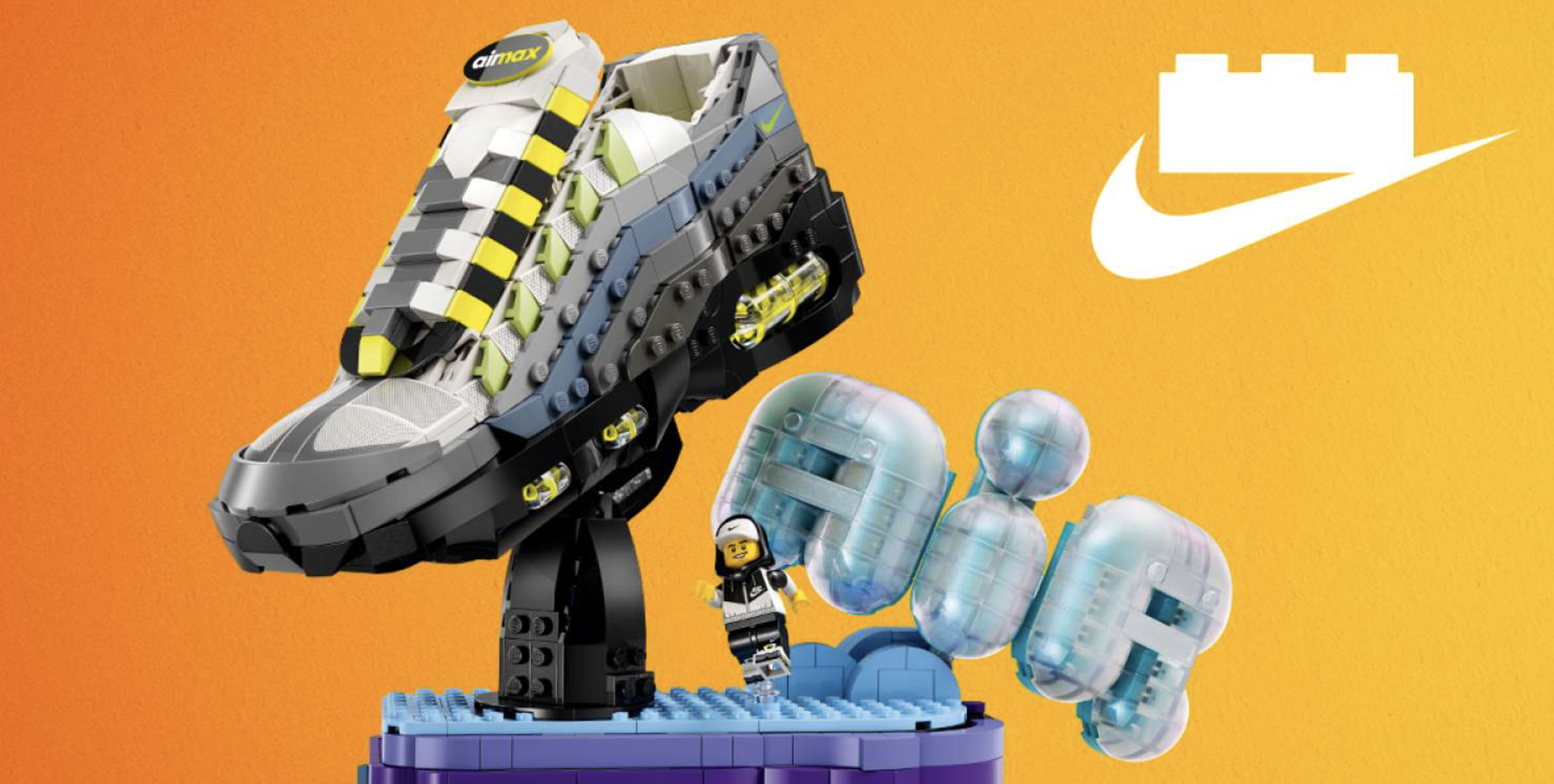 LEGO — pixel art as playful creativity
Integrates pixel-style graphics through gaming collaborations and digital content, using blocky 8-bit visuals to connect its physical building system with digital play. Naturally aligns with LEGO's modular identity.
LEGO — pixel art as playful creativity
Integrates pixel-style graphics through gaming collaborations and digital content, using blocky 8-bit visuals to connect its physical building system with digital play. Naturally aligns with LEGO's modular identity.
-
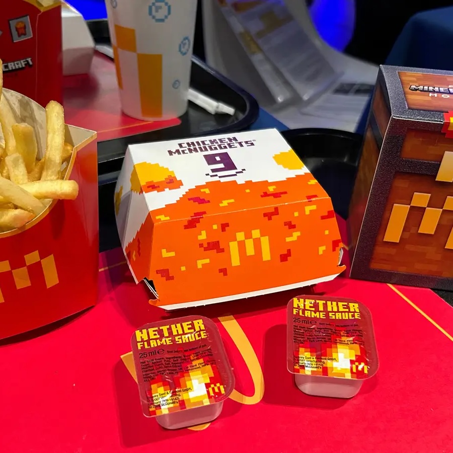 McDonald's — pixel art as cultural engagement
Incorporates pixelated graphics and retro gaming aesthetics into campaigns and packaging, creating playful, nostalgia-driven moments tied to pop culture. Leverages gaming culture to connect with younger audiences.
McDonald's — pixel art as cultural engagement
Incorporates pixelated graphics and retro gaming aesthetics into campaigns and packaging, creating playful, nostalgia-driven moments tied to pop culture. Leverages gaming culture to connect with younger audiences.
How to bring these trends together for your next event
The most successful events don't pick just one trend — they layer them thoughtfully.
- AI visuals + gradients: Pair them for a modern, elevated look.
- Gradients + sustainable materials: Combine them for eco-conscious branding that reads as a unified story.
- Pixel details: Add them sparingly for personality and nostalgia without overwhelming the design.
For event planners juggling creativity, logistics, and experience design, these trends offer something powerful: ways to stand out without overcomplicating your artwork.
When your branding is intentional — from signage to badges — you're not just designing an event. You're designing an experience attendees will remember long after they take their badge off.